# Mastering the Art of Excel Pie Charts: A Comprehensive Guide
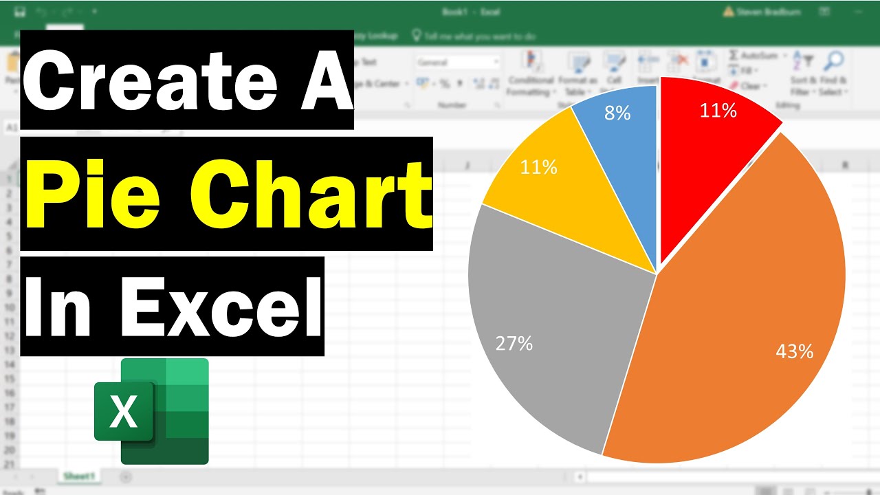
Creating a pie chart in Excel is a straightforward process that can visually represent data proportions effectively. A well-made pie chart can quickly communicate the share of each category within a whole, making it an invaluable tool for presentations, reports, and data analysis. This guide will walk you through the steps to create, customize, and enhance your Excel pie charts for maximum impact.
Pie charts are best used when you want to show how a single total is divided into parts. For instance, you could use a pie chart to illustrate market share, budget allocation, or survey responses. However, it’s important to note that pie charts become less effective with too many categories, as it can become difficult to distinguish between similar slices.
| Category | Details |
|—|—|
| **Topic** | Creating Pie Charts in Excel |
| **Objective** | To visually represent data proportions |
| **Key Steps** | Data selection, chart insertion, customization |
| **Best Use Cases** | Market share, budget allocation, survey results |
| **Limitations** | Becomes cluttered with too many categories |
| **Reference Website** | [Microsoft Excel Help](https://support.microsoft.com/en-us/excel) |
## Creating Your First Pie Chart
The journey to a compelling pie chart begins with your data. Ensure your data is organized in columns or rows, with one column or row representing the categories (the “labels”) and another representing the numerical values (the “slices”).
### Selecting and Inserting the Chart
1. **Select your data:** Click and drag your mouse to highlight the cells containing your data, including the category labels and their corresponding values.
2. **Insert the chart:** Navigate to the “Insert” tab on the Excel ribbon. In the “Charts” group, click on the “Insert Pie or Donut Chart” icon.
3. **Choose your pie chart type:** A dropdown menu will appear, offering various pie chart options like “Pie,” “Exploded Pie,” “3-D Pie,” and “Doughnut.” For a standard pie chart, select the first “Pie” option.
Excel will immediately generate a pie chart based on your selected data, placing it directly onto your worksheet.
## Customizing Your Pie Chart for Clarity and Impact
Once your pie chart is created, customization is key to making it informative and visually appealing. Excel offers a range of options to refine its appearance.
### Chart Elements and Styles
After clicking on the chart, two new tabs will appear on the ribbon: “Chart Design” and “Format.” These tabs provide access to extensive customization tools.
* **Chart Elements:** Use the “+” icon next to your chart to add or remove elements like Chart Title, Data Labels, and Legend.
* **Chart Styles:** The “Chart Design” tab offers pre-set styles that can quickly change the overall look of your chart. Experiment with different styles to find one that best fits your aesthetic.
### Data Labels and Formatting
Adding data labels is crucial for providing specific values for each slice.
* **Adding Data Labels:** Click the “+” icon next to the chart and select “Data Labels.” You can then choose where to position these labels (e.g., “Best Fit,” “Outside End,” “Center”).
* **Formatting Data Labels:** Right-click on any data label and select “Format Data Labels.” This opens a pane where you can control the label’s content (e.g., show category name, percentage, or value), font, color, and alignment.
A pie chart should ideally have no more than 5-7 slices for optimal readability. Too many slices can make the chart cluttered and difficult to interpret.
## Advanced Pie Chart Techniques
To further enhance your pie charts, consider these advanced techniques.
### Exploding Slices for Emphasis
If you want to highlight a particular category, you can “explode” its slice. This means pulling that slice slightly away from the center of the pie.
1. **Single Slice Explosion:** Click once on the pie chart to select the entire chart. Then, click again on the specific slice you want to emphasize. Drag that slice away from the center.
2. **Exploded Pie Chart:** Alternatively, when inserting the chart, you can choose the “Exploded Pie” option from the “Insert Pie or Donut Chart” menu. This will automatically pull all slices slightly out.
### Using 3-D Effects
Excel also offers 3-D effects for pie charts, which can add a sense of depth. However, use these sparingly, as they can sometimes distort the visual perception of the slice sizes.
* **3-D Pie Options:** In the “Chart Design” tab, under “Change Chart Type,” you can select a “3-D Pie” chart. You can also access 3-D Rotation options within the “Format” tab to adjust the angle and perspective.
## Frequently Asked Questions (FAQ)
### Q1: How do I change the colors of the pie chart slices?
**A1:** Select the pie chart, then click on the specific slice you want to re-color. Go to the “Format” tab, and in the “Shape Styles” group, click “Shape Fill” to choose a new color.
### Q2: Can I create a pie chart with data from multiple sources?
**A2:** Yes, you can. You’ll need to consolidate your data into a single table or range first before inserting the pie chart.
### Q3: What is the difference between a pie chart and a doughnut chart?
**A3:** A doughnut chart is similar to a pie chart but has a hole in the center. This allows you to display additional data in a ring in the center, or it can simply be a stylistic choice.
The first pie chart was presented by William Playfair in his 1801 book “The Statistical Breviary,” where he used it to show proportions of the European and Asian parts of the Turkish Empire.
Here’s a summary of key considerations when creating and using pie charts:
* **Data Organization:** Ensure your data is neatly arranged with clear labels and corresponding values.
* **Simplicity:** Avoid overwhelming the chart with too many categories.
* **Clarity:** Use data labels and a legend effectively to explain your chart.
* **Context:** Always provide a clear title and consider adding annotations for key insights.
By following these guidelines, you can create professional and insightful pie charts in Excel that effectively communicate your data’s story.
* **Chart Title:** Clearly defines what the chart represents.
* **Legend:** Identifies each category and its corresponding color.
* **Data Labels:** Displays the actual values or percentages of each slice.
* **Exploded Slices:** Used to emphasize a specific data point.